
Welcome back guys, this post is going to be about mixing prints and patterns but we’re going to focus on abstract prints. There are normal guidelines on mixing prints like
1. Keep both prints in the same color family.
2. Let one print dominate the other.
3. Pair print with neutrals for easy vibe. And a couple others.
 The other two guidelines I only just found out and I thought I should share with you guys.
1. Consider stripe print as a neutral. Neutrals in fashion are colors that can go with anything and they include black, gray, white, brown, khaki.
Patterned neutral colors include glen plaid, pin stripes, tweeds and tiny checks.
2. Abstract prints can be paired with almost any other print. Abstract art uses visual representation of shapes and colors but they are not intended to represent anything in particular.
The best form of abstract print i can recommend is our Ankara prints and this explains why we can sometimes mix two different Ankara fabrics not in the same color family and the outfit will still look fabulous.
This is me mixing an abstract print with a plaid print.  Thanks for stopping by, regardless the rules and guidelines. If you feel you look good then trust me you look amazing 😊.
 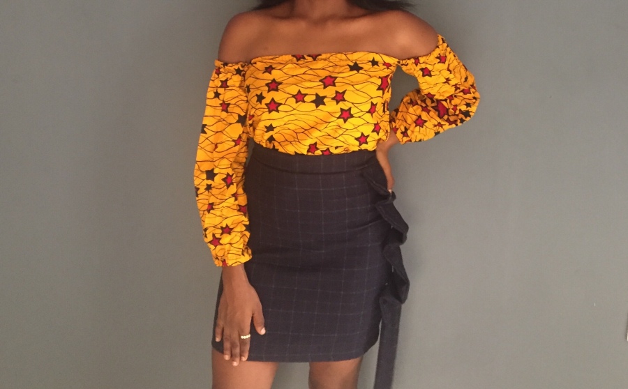 You can buy this outfit Here

This is pretty and great tips! I never want to mix prints because I’m scared of the outcome
LikeLike
Oh you should definitely try mixing prints. It’s really nice dear. Thanks for reading.
LikeLiked by 1 person